

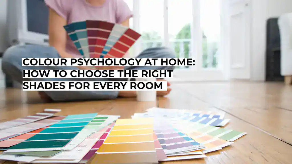
Colour Psychology at Home: How to Choose the Right Shades for Every Room
[et_pb_section fb_built=”1″ _builder_version=”4.16″ _module_preset=”default” custom_padding=”||20px|||” global_colors_info=”{}”][et_pb_row _builder_version=”4.16″ _module_preset=”default” custom_padding=”|||14px||” global_colors_info=”{}”][et_pb_column type=”4_4″ _builder_version=”4.16″ _module_preset=”default” global_colors_info=”{}”][et_pb_divider _builder_version=”4.27.4″ _module_preset=”default” global_colors_info=”{}”][/et_pb_divider][et_pb_text _builder_version=”4.27.8″ _module_preset=”default” custom_padding=”9px|24px|7px|23px||” global_colors_info=”{}”]
Colour Psychology at Home: How to Choose the Right Shades for Every Room
Rather than treating colour psychology as a set of rigid rules, it makes more sense to start with what each room needs to do. From busy family kitchens to bedrooms designed for switching off, the right palette should support everyday life while still making your home feel like yours.
Start With the Room, Not the Colour Chart
Before collecting paint swatches, think about the atmosphere you want to create. A kitchen might need to feel bright and sociable during a rushed weekday breakfast, while a living room may need to work for family film nights, quiet afternoons and the occasional gathering.
This approach is more useful than assigning a fixed emotion to every colour. Red doesn’t automatically make a room energetic, just as blue cannot guarantee relaxation. The effect depends on the particular shade, the amount of natural light and everything sitting alongside it.
It also helps to look beyond the walls. Flooring, cabinetry, curtains, sofas, woodwork and heating can all contribute to the palette. Start by identifying colours that already exist in the room and can’t easily change. Wooden floors may introduce warm brown or honey tones, while stone worktops could bring grey, cream or subtle green into the scheme. Once you know what is staying, you can choose new shades that sit comfortably beside those features.
Give Kitchens Energy Without Making Them Overwhelming
Kitchens often contain more visual detail than other rooms. Cupboard doors, handles, appliances, splashbacks, worktops and flooring compete for attention before you have even opened a tin of paint.
For that reason, consider how much colour the room can comfortably carry. Warm off-whites, muted greens and earthy shades can provide a welcoming background without fighting with cabinetry or patterned tiles. If you love stronger colours, try using them across a smaller area, such as an island, alcove or run of lower cupboards.
Natural and artificial light matter here too. A colour that looks fresh on a sample card may appear much darker in a north-facing kitchen or under warm bulbs. Paint test patches in several parts of the room, then check them in the morning, afternoon, and evening before committing.
Make Bedrooms Feel Restful to You
Bedrooms are often associated with quiet colours, but there’s no universal shade that makes everyone relax. Some people prefer pale neutrals and soft blues, while others feel far more comfortable surrounded by deep green, brown or burgundy.
Instead of following a supposed psychological formula, ask what visually helps you wind down. If you find high contrast distracting, keep the walls, bedding and curtains relatively close in tone. If a darker room feels cosy, richer shades can create that effect, particularly when you repeat them through textiles and accessories.
Remember you will see your bedroom under artificial light most of the time you use it. Test colours after sunset as well as during daylight. Lamps with warm bulbs can noticeably change creams, pinks, greens and greys.
Treat Every Visible Surface as Part of the Palette
A coordinated room doesn’t require everything to match. In fact, repeating a few related tones usually feels more natural than choosing identical colours for every surface.
Start with the largest areas, such as walls, flooring and substantial pieces of furniture. Then consider smaller fixed features. Door frames, shelving, skirting boards and radiators can either sit quietly within the palette or provide contrast.
This is where coloured radiators become useful from a design perspective. Rather than defaulting to white, you could choose a shade that relates to cabinetry, walls or another feature in the room. Look at the coloured options available at ukradiators.com. You can find a radiator that’s part of the overall colour scheme instead of an afterthought.
The same principle works elsewhere. A dark radiator against a dark wall can create a more continuous look, while a contrasting finish can turn a functional fitting into a deliberate visual detail.
[/et_pb_text][et_pb_image src=”https://broodmagazine.com/wp-content/uploads/2026/08/Colour-Psychology-at-Home.webp” alt=”A smiling man cuts vegetables on a wooden board while a woman hugs a child in a bright kitchen, cooking together.” title_text=”Colour Psychology at Home” align=”center” _builder_version=”4.27.8″ _module_preset=”default” global_colors_info=”{}”][/et_pb_image][et_pb_text _builder_version=”4.27.8″ _module_preset=”default” global_colors_info=”{}”]
[Image from UK Radiators]
[/et_pb_text][et_pb_divider _builder_version=”4.27.4″ _module_preset=”default” global_colors_info=”{}”][/et_pb_divider][et_pb_text _builder_version=”4.27.5″ _module_preset=”default” global_colors_info=”{}”]SPONSORED CONTENT:
[/et_pb_text][et_pb_code _builder_version=”4.27.7″ _module_preset=”default” global_colors_info=”{}”]


Let Living Rooms Handle More Than One Mood
Living rooms tend to serve several purposes, especially in busy family homes. The same space might host children playing in the afternoon, adults unwinding in the evening, and friends visiting at the weekend.
A flexible base can make those different uses easier to accommodate. Neutrals don’t have to mean plain white. Clay, mushroom, warm grey, and soft beige can provide a quieter backdrop for artwork, cushions, and furniture.
Alternatively, deeper colours can make a large living room feel more intimate. The key is to consider balance. If the walls carry plenty of colour, leaving some furniture or textiles relatively restrained can prevent the room from feeling visually crowded.
Most importantly, choose colours you actually enjoy living with. Trends can offer inspiration, but your living room has to work long after a fashionable shade disappears from social feeds.
Keep Home Offices Comfortable and Focused
A home office needs to support concentration without feeling clinical. Very bright colours may feel distracting across a large area, while extremely dark schemes can make a small workspace feel enclosed if there is limited daylight.
Muted greens, blues, and warm neutrals are popular choices because they pair easily with wood, metal, and typical office furniture. This doesn’t mean they automatically improve productivity. Your working habits, lighting, noise levels and desk setup matter far more than a paint colour alone.
Pay particular attention to the wall behind your monitor and the surfaces within your direct field of vision. A comfortable level of contrast can make the space easier to spend time in, while a favourite colour used on shelving or artwork can add personality without dominating the room.
Final Thoughts
Colour psychology can provide ideas, but it should never become a rulebook for your home. Rooms feel successful when their colours suit their purpose, lighting, existing features and, above all, the people using them.
Begin with what can’t easily change, decide how you want the room to feel, and test potential shades in real conditions. Then consider every visible surface, not just the walls. A thoughtful palette grows from the whole room, creating a coherent home without sacrificing personality.
[/et_pb_text][/et_pb_column][/et_pb_row][/et_pb_section][et_pb_section fb_built=”1″ admin_label=”Related Articles” _builder_version=”4.16″ global_colors_info=”{}”][et_pb_row _builder_version=”4.27.4″ _module_preset=”default” global_colors_info=”{}”][et_pb_column type=”4_4″ _builder_version=”4.27.4″ _module_preset=”default” global_colors_info=”{}”][et_pb_divider divider_weight=”5px” _builder_version=”4.27.4″ _module_preset=”default” global_colors_info=”{}”][/et_pb_divider][et_pb_text _builder_version=”4.27.5″ _module_preset=”default” global_colors_info=”{}”]SPONSORED CONTENT:
[/et_pb_text][et_pb_code _builder_version=”4.27.5″ _module_preset=”default” global_colors_info=”{}”]


Links
[/et_pb_text][/et_pb_column][et_pb_column type=”1_2″ _builder_version=”4.16″ global_colors_info=”{}”][et_pb_text _builder_version=”4.16″ header_6_font=”Montserrat|700||on|||||” header_6_line_height=”1.8em” custom_margin=”||10px||false|false” locked=”off” global_colors_info=”{}”]
Follow Us
[/et_pb_text][et_pb_social_media_follow icon_color=”#FFFFFF” _builder_version=”4.27.5″ _module_preset=”default” custom_button=”on” button_font=”Montserrat|||on|||||” text_orientation=”center” custom_margin=”4px|-41px|4px|-41px||” custom_padding=”9px|68px|9px|48px||” global_module=”100570″ saved_tabs=”all” global_colors_info=”{}”][et_pb_social_media_follow_network social_network=”instagram” url=”https://www.instagram.com/broodmagazine” _builder_version=”4.20.2″ _module_preset=”default” background_color=”#ea2c59″ global_colors_info=”{}” follow_button=”off” url_new_window=”on”]instagram[/et_pb_social_media_follow_network][et_pb_social_media_follow_network social_network=”facebook” url=”https://www.facebook.com/broodmagazine” _builder_version=”4.16″ _module_preset=”default” background_color=”#3b5998″ global_colors_info=”{}” follow_button=”off” url_new_window=”on”]facebook[/et_pb_social_media_follow_network][et_pb_social_media_follow_network social_network=”linkedin” url=”http://www.linkedin.com/company/brood-magazine” _builder_version=”4.16″ _module_preset=”default” background_color=”#007bb6″ global_colors_info=”{}” follow_button=”off” url_new_window=”on”]linkedin[/et_pb_social_media_follow_network][et_pb_social_media_follow_network social_network=”twitter” url=”https://www.twitter.com/broodmagazine1″ _builder_version=”4.22.2″ _module_preset=”default” background_color=”#000000″ global_colors_info=”{}” follow_button=”off” url_new_window=”on”]twitter[/et_pb_social_media_follow_network][et_pb_social_media_follow_network social_network=”tiktok” url=”https://www.tiktok.com/@broodmagazine” _builder_version=”4.16″ _module_preset=”default” background_color=”#fe2c55″ global_colors_info=”{}” follow_button=”off” url_new_window=”on”]tiktok[/et_pb_social_media_follow_network][et_pb_social_media_follow_network social_network=”youtube” url=”https://www.youtube.com/channel/UCzLh30eP7Tvcys8O6NG3LDA” _builder_version=”4.16″ _module_preset=”default” background_color=”#a82400″ global_colors_info=”{}” follow_button=”off” url_new_window=”on”]youtube[/et_pb_social_media_follow_network][/et_pb_social_media_follow][/et_pb_column][/et_pb_row][/et_pb_section]